
Project Overview
MovieHouse is a mobile app designed to make it easier for people to discover movies, book tickets, and get reminders for showtimes — all in one smooth, mobile-first experience.
Goal
User Goal: Help users quickly find and book movie tickets while staying informed about showtimes and theaters.
Business Goal: Increase digital ticket sales, reduce queue pressure, and improve user satisfaction through a self-service platform.
Key Outcome
The app led to increased user satisfaction by speeding up the booking process, earning positive feedback like “very simple and intuitive.” It also reduced the time it took to complete a ticket purchase and boosted engagement through features such as reminders and ticket sharing.
Problem Statement
Booking movie tickets was frustrating due to:
Long queues at theaters
Lack of real-time seat or showtime info
Unreliable online payment options
Solution
Design a clean and intuitive mobile app that allows users to:
Discover movies easily with thumbnails and search
View updated showtimes and movie details
Securely book and pay for tickets
Get reminders for upcoming shows
Share tickets with friends post-purchase
Impact
After testing and refinement, the final design achieved great results:
Faster ticket booking: Users were able to complete a booking in under 1 minute
Positive feedback: Users described the app as “very simple and intuitive”
Increased engagement: Reminder and share features encouraged users to return and bring others along
Higher user confidence: Clearer flows and better payment visibility made the process more trustworthy
Research
Empathizing with users to understand their pain points
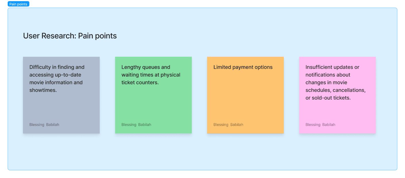
To understand the needs and frustrations of potential users, I conducted user interviews and created empathy maps. Most participants were college students looking for stress relief through movies. While I initially assumed their biggest barrier was a busy schedule, the research revealed deeper pain points:
Long lines at cinemas
Poor or missing info on movie showtimes and seat availability
Frustration with unreliable online payment systems
I asked questions like:
How often do you go to the movies?
What challenges do you face when booking tickets?
How would you improve the current process?
From these insights, I created personas, user stories, and a user journey map to visualize their experience from start to finish. This helped me focus on real problems and prioritize features like easy ticket search, clear showtime info, smooth payments, and reminders.
Ideation & User Flows
To begin the design process, I conducted a competitive audit to explore what other movie ticketing apps were doing well and where they fell short. This helped me identify opportunities to create a smoother, more user-friendly experience.
I then defined the problem with a key question:
“How might we simplify the movie ticket booking process to make it faster and more intuitive for users with busy schedules?”
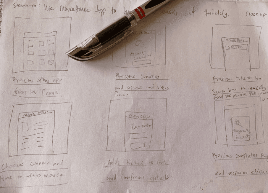
Using Crazy 8s, I rapidly sketched out different layout ideas and interaction patterns. I marked the most effective elements to include in the first digital wireframes.
I also created a storyboard to visualize how a user might move through the app — from opening MovieHouse to discovering a film, booking a ticket, and getting a reminder for the show.
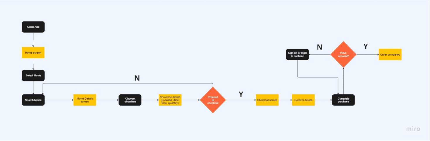
Then, I mapped out user flows for key tasks like:
Finding a movie using search or scroll
Viewing showtimes and movie details
Selecting a date and time
Choosing quantity and payment method
Setting reminders and sharing tickets
These flows helped ensure that the experience would feel smooth and familiar while still solving the user’s core problems.
Designs, Iterations & Testing
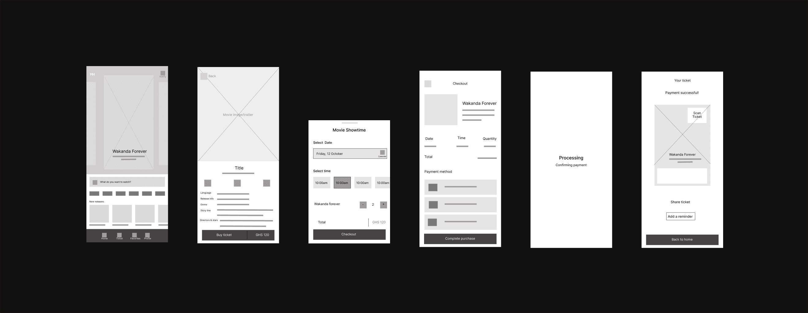
I started by translating ideas from sketches into low-fidelity wireframes, focusing on solving key pain points: making it easy to find movies, book tickets quickly, and avoid confusion during checkout.
Key design choices included:
Big movie thumbnails for faster visual scanning
A prominent search bar to help users find movies quickly
A clean layout that guided users from discovery to checkout in fewer steps
Once the wireframes were ready, I created an interactive low-fidelity prototype to test the full flow — from browsing a movie to completing a ticket purchase.
User Testing
I conducted a usability study to get feedback on the design. Test participants completed tasks like finding a movie, booking a ticket, and setting a reminder.
Here’s what I learned:
Users loved the movie cards and the add reminder feature
he “Buy Ticket” button label caused a bit of confusion, so I updated it to be clearer
Some users didn’t understand how the “Share Ticket” feature worked, so I added a quick note/toast for clarity
I used affinity diagramming to group user feedback into themes and used those insights to improve the design before creating the final high-fidelity version.
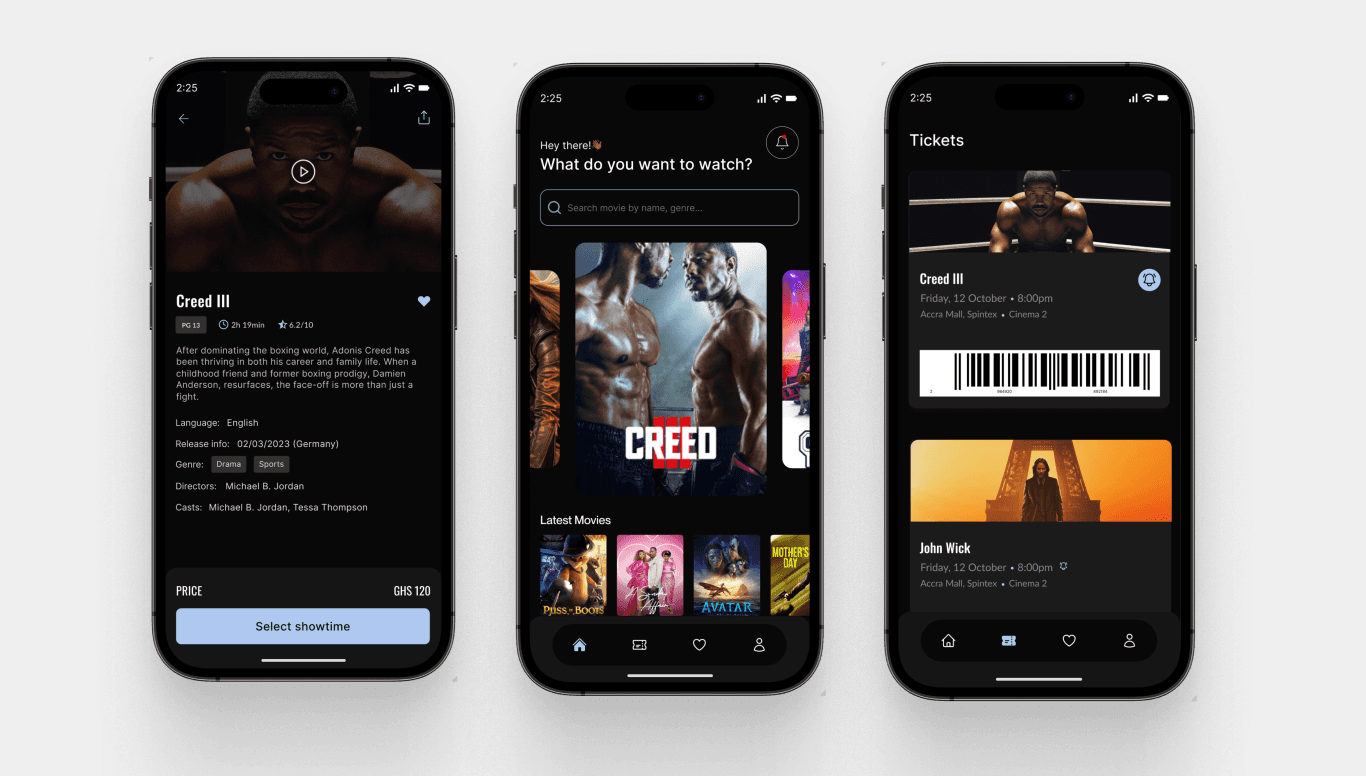
Final Designs, Impact, Lessons Learnt
The final high-fidelity designs focused on creating a clean, intuitive mobile experience. Key features included:
A visually engaging home screen with movie cards
A quick and clear checkout flow that reduced user effort
A reminder option to help users remember upcoming showtimes
A ticket sharing feature to make group viewing more convenient
The interface used bold visuals, clear typography, and logical spacing to guide users naturally through the app without confusion.
Lessons Learned
Test early and often: Usability testing uncovered small issues that made a big difference
Keep it simple: The simplest flows performed best with users
Small details count: Features like reminders and clearer button labels made the app feel more thoughtful and complete